ODYSSEY TRAVEL APP
OBJECTIVE
Design an app that you think will be useful in people’s everyday lives. When coming up with ideas we thought about combining many of our thoughts together to form Odyssey. We wanted to bring parking, food, events, and directions all together in an easy to use app.
DESIGN & DELIVERABLES
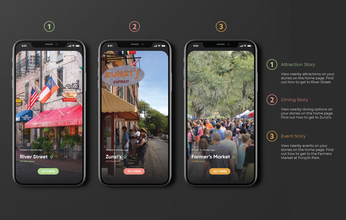
The design is a simple use of glass morphism with a dark mode style background to make the colors pop more. The colors themselves are categorized based on the different functions of the app. Green is attractions, red is dining, orange is events, and blue is parking.
This allows for a quick understanding of what section you are in.
CONCEPT
The name comes from Odysseus in Homer’s epic poem Odyssey. It translates to “a long and eventful or adventurous journey or experience.” The essence of travel was what we were trying to capture within our app. Odyssey is not just an app to help take you where you want to go, but it is a memory bank for all of your travels as well. It has an algorithm that picks out things you might like in new cities you visit based on past experiences. Nearby stories also give a live feed of what is happening in the city and what is most popular. The biggest function is the ability to sort your options based on personal preference so you can find something that suits your needs exactly. Once you find something that suit you, Odyssey will give you more information about it and then give you directions and options for parking nearby.
In collaboration with...
Dallin Higgins (User Experience Design)
Charlie Bowles (User Experience Design)
Leah Feniger (Graphic Design)
Savanna Heishman (Graphic Design)
The Video
Video Created by Dallin Higgins
The Interface


